Product Designer Senior
Lead designer
Ux/Ui Designer
Design strategy
Peetchr AI
Product Design SaaS platform
From Idea to MVP: Designing a Social-First Recruitment Platform that Engages Gen Z and Streamlines the HR Process
Skills
Delivery
Full MVP prototype
User interview
User research
Design system
Tools & Software
Figma
Jira
Confluence
Shadcn
Fields
AI Agent
HR recrutement
Social Media
Start-up
The Challenge
Today, 60% of candidates abandon their applications due to processes that feel too long, complex, and disengaging. Traditional recruitment platforms—with their tedious forms and fragmented workflows—struggle to attract and retain Gen Z, a hyper-connected generation accustomed to seamless, fast-paced digital experiences, especially on social media.
At the same time, recruiters face several operational hurdles:
- A growing stack of tools to manage (LinkedIn, ATS, Excel…),
- A significant time investment required to create and publish each job offer,
- Difficulty tracking and prioritizing candidates efficiently.
Core Problem:
How can we reconnect recruiters with Gen Z talent, radically simplify the recruitment experience, and improve conversion rates throughout the process?
Objectives
My client, Peetchr, aimed to build an MVP that would:
- Validate product–market fit,
- Enable a fast fundraising round,
- Drastically reduce the time required to process job applications,
- Provide candidates with an experience aligned with their daily habits on social media platforms.
Role
Upon recommendation from a former colleague (the PM), I joined the project at its very inception, before any UX concepts had been explored. I took full ownership of the UX/UI design, from strategic framing all the way to the delivery of a functional MVP. My responsibilities included:
-
Strategic interviews with the CEO and CMO (both with 20+ years of recruitment expertise),
-
In-depth competitor analysis and UX benchmarking,
-
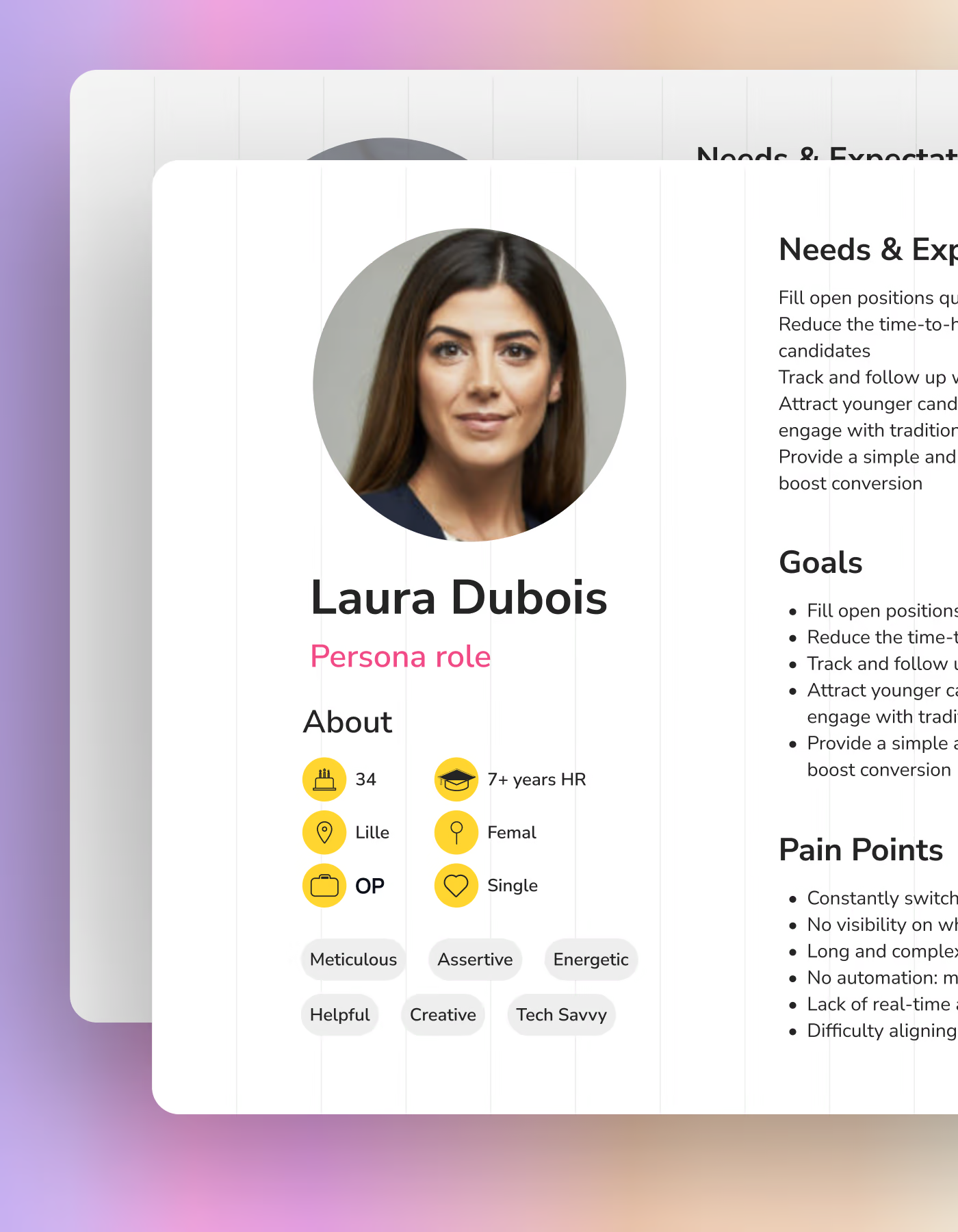
Definition of key personas and user journeys for each role (recruiter, manager, candidate),
-
End-to-end product design: wireframing, prototyping, and rapid iterations,
-
User testing and UX validation,
-
Delivery of a high-fidelity, developer-ready MVP prototype in Figma, along with a fully documented design system.
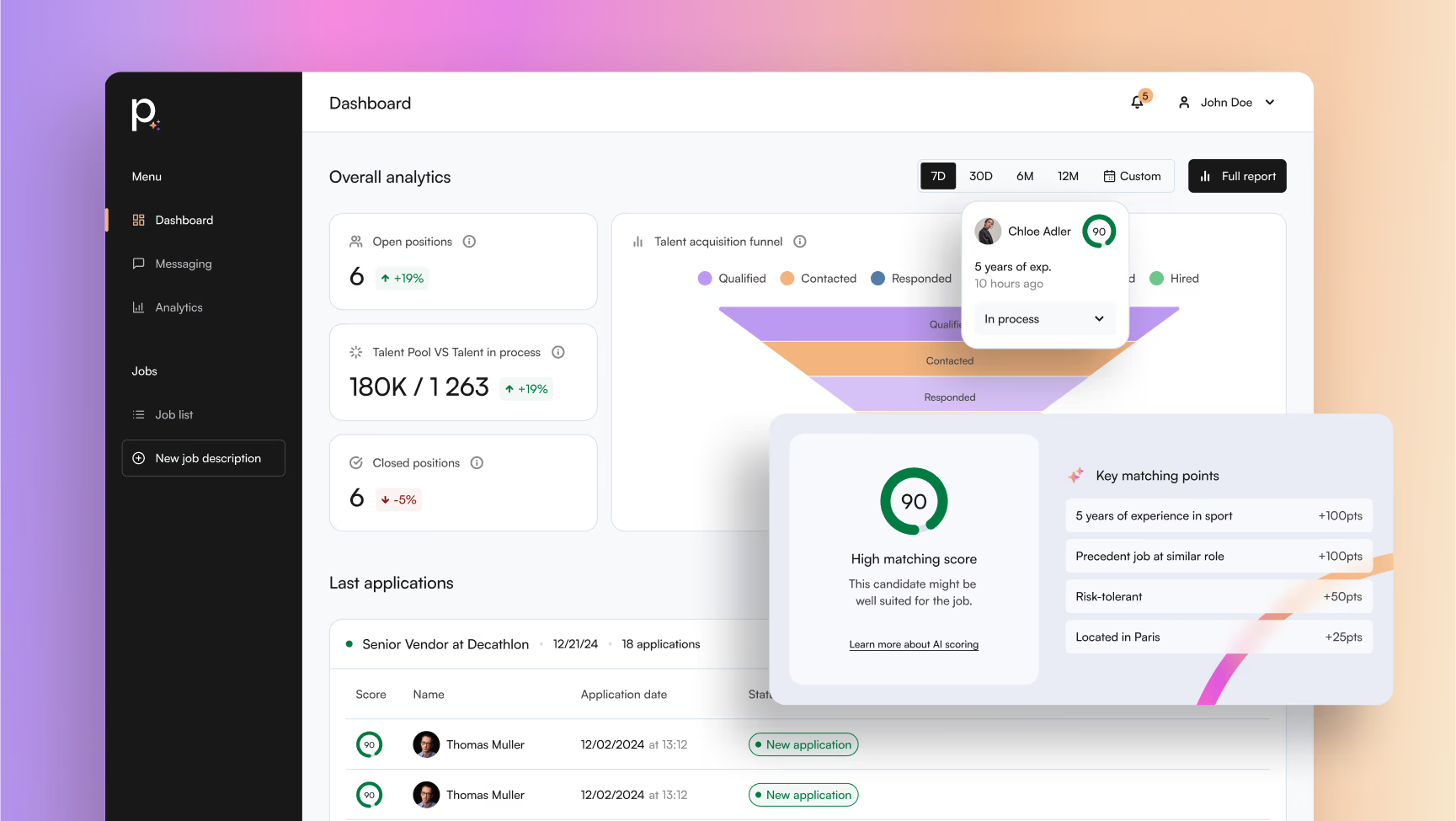
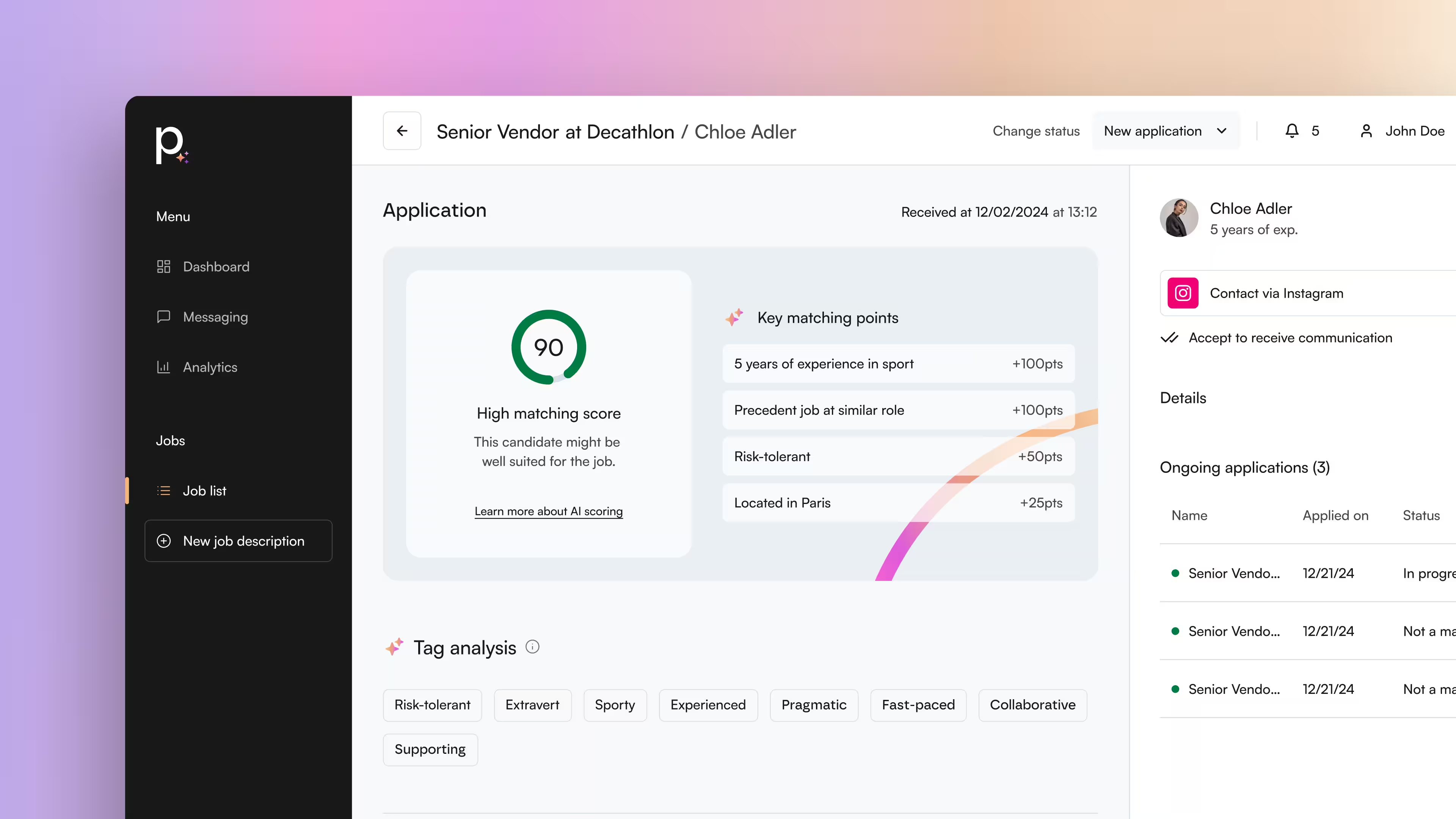
AI-Assisted Job Offer Creation – User Flow Prototype
UX Approach and Methodology
1. Strategic Framing
-
Conducted in-depth interviews with the founders to understand their business vision,
-
Identified key pain points in existing recruitment platforms,
-
Performed a detailed UX benchmark of competitors (e.g. Welcome to the Jungle, LinkedIn, various ATS solutions).
2. User-Centered Design
-
Clearly defined three key personas,
-
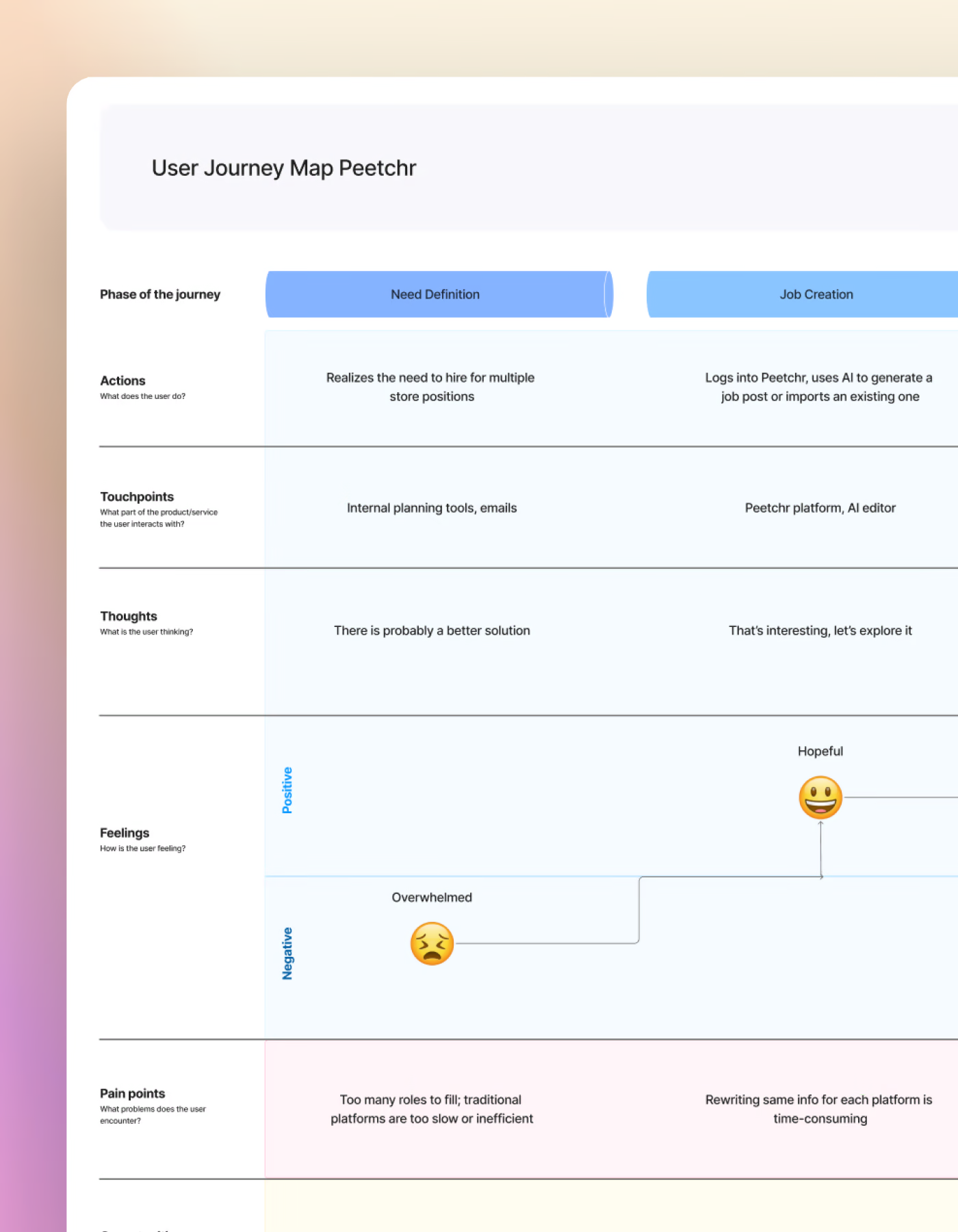
Mapped out user journeys tailored to each role (recruiter, candidate, manager),
-
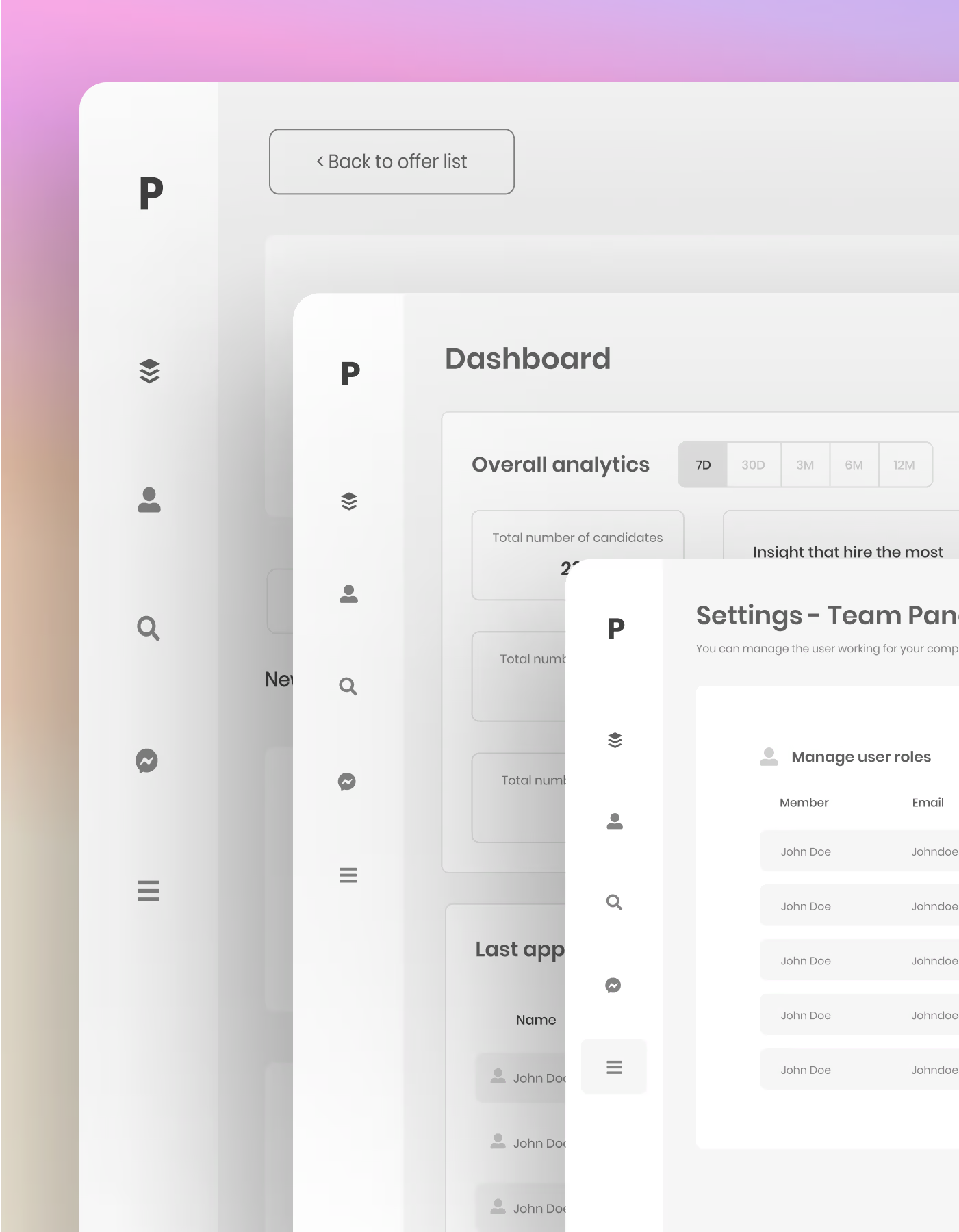
Designed initial wireframes aligned with the founders’ vision and industry expertise,
-
Iterated multiple times internally before moving on to user testing.
Peetchr Persona, wireframe and User map Journey
3. User Testing: A Valuable Source of Insights
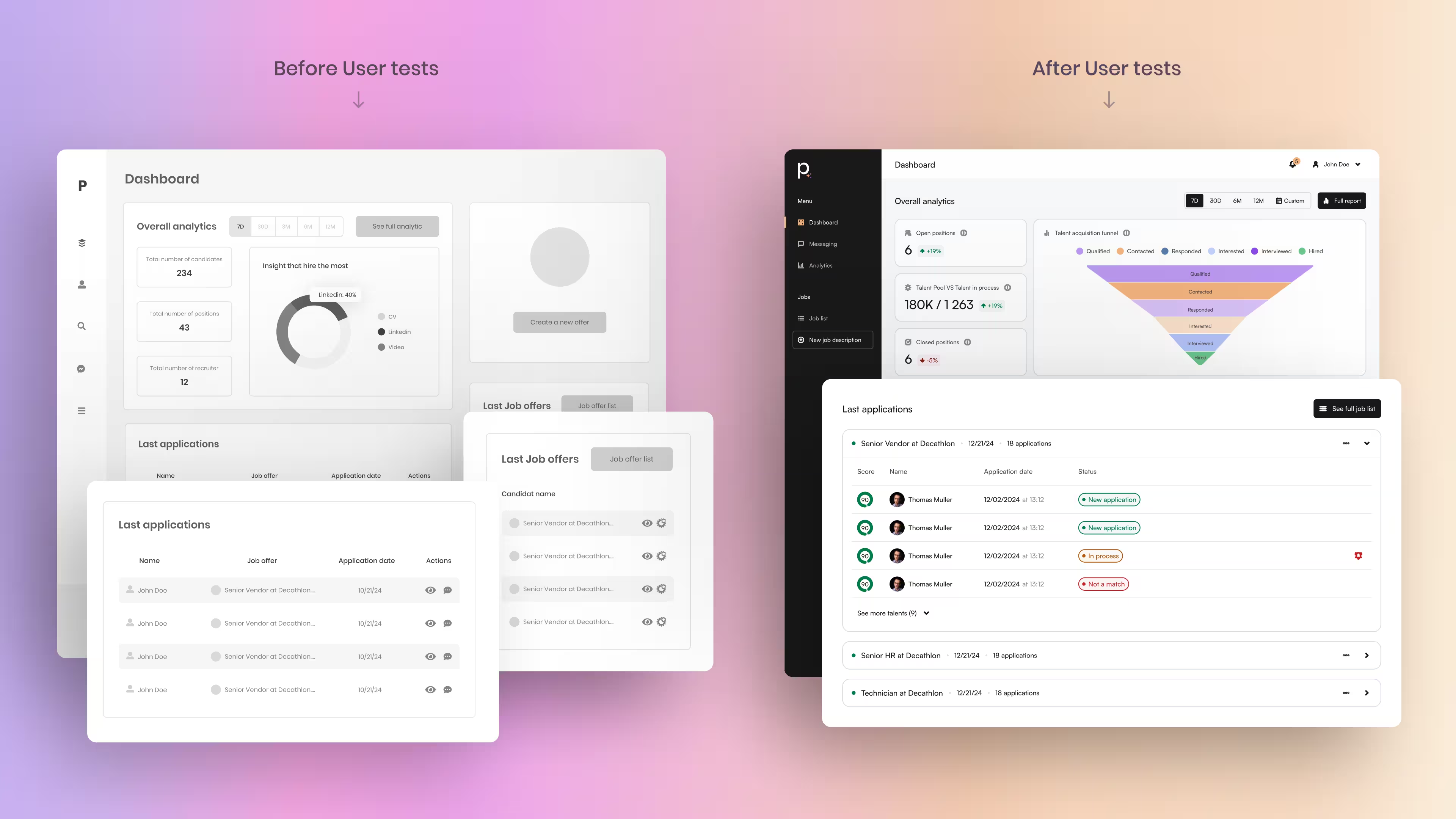
To validate and refine the interface, I conducted a series of qualitative user tests with participants that closely matched the defined personas. These sessions revealed several key areas for improvement:
-
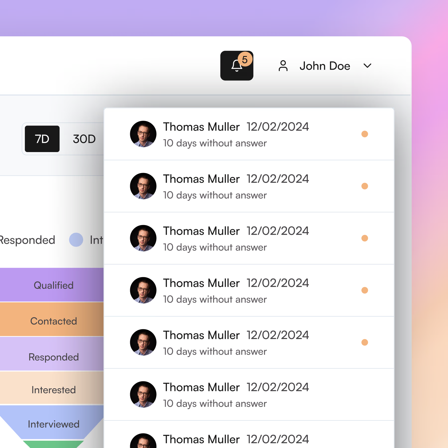
Integration of an automated alert system, ensuring recruiters don’t miss any potential candidates.
-
Merging the “Latest Jobs” and “New Applications” sections into a single, more relevant block displaying recent applications by job listing.
-
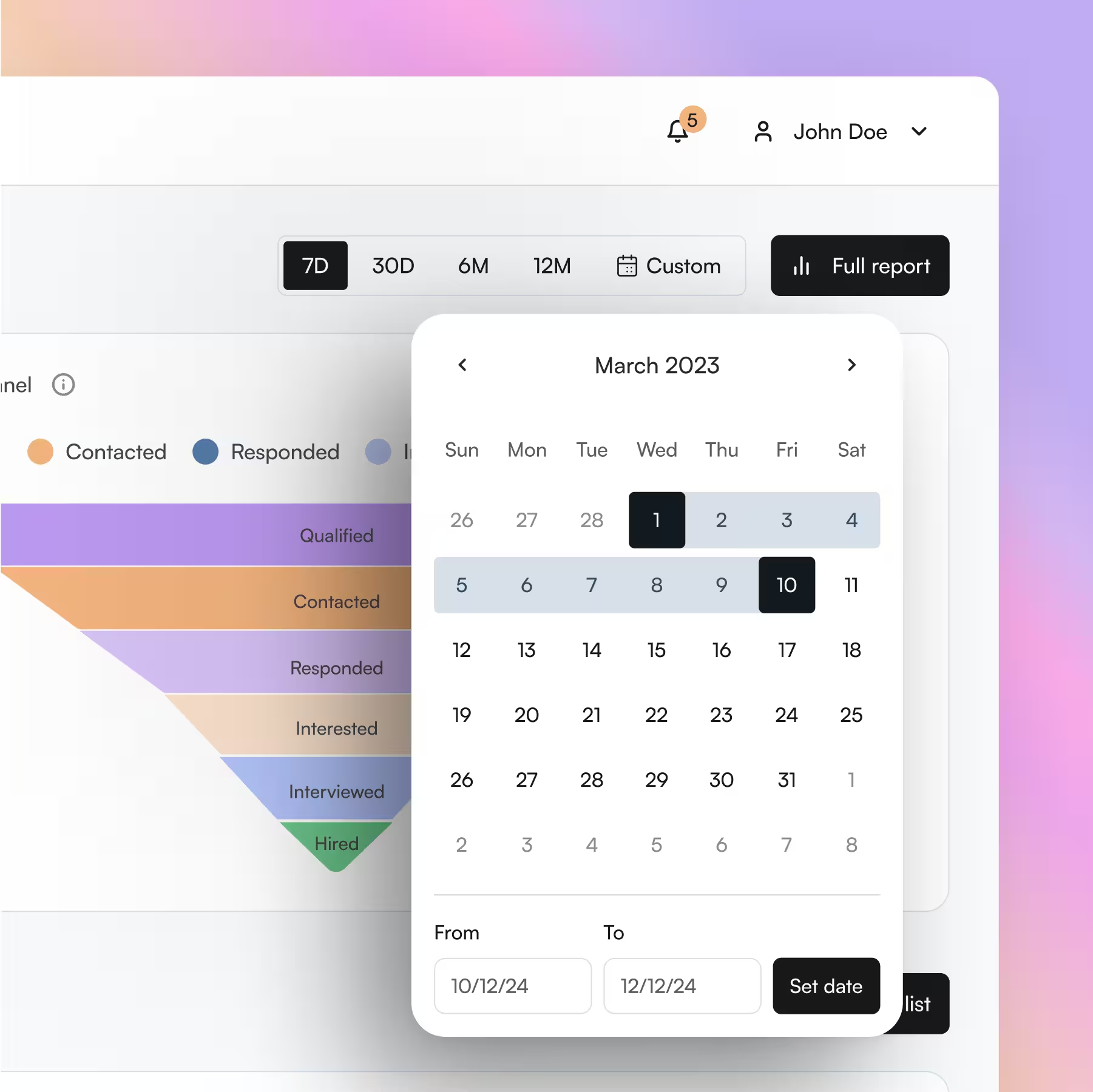
Enhancement of the dashboard’s data visualization, including more insightful charts and filters by granularity and date range.
-
As well as many other actionable insights that helped improve the overall product experience.
Improved Through User Feedback
After the first round of testing on wireframes, I felt confident about the direction of the design. However, I quickly realized there was a significant gap between my initial product vision and how users actually interacted with the interface. This moment is part of what makes product design so rich, it reminded me of the importance of involving users early in the process, and the value of iterative, real-world testing.
Following these improvements, the SUS (System Usability Scale) score jumped from 68/100 in the first round to 92/100 after the second iteration, clearly validating the power of a user-centered approach.
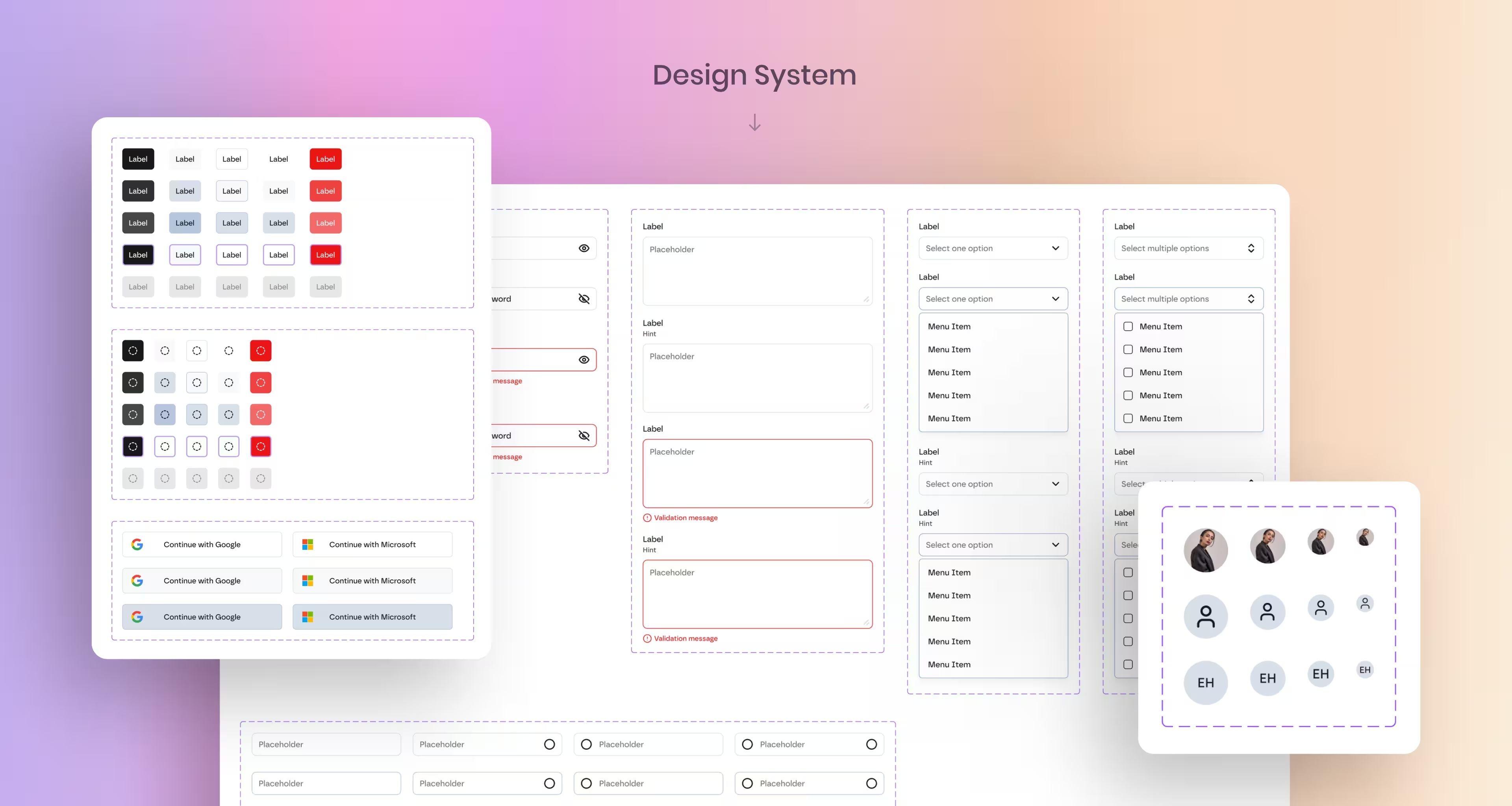
Design System
A modular, reusable design system built to streamline development, ensure visual consistency, and accelerate future product iterations.
Fully documented and aligned with the dev stack (shadcn/ui), it includes components, tokens, and usage guidelines tailored to Peetchr’s brand and interface logic.
Key Results
-
MVP validated through user testing: strong adoption with a final SUS score of 92/100
-
Successful fundraising enabled by the prototype
-
Application processing time reduced from 3 weeks to an average of 24 hours
-
22% more applications processed thanks to AI-powered scoring
What I Learned
-
The importance of involving both users and founders early to build the right solution
-
The value of an agile UX approach: test early, iterate quickly, learn constantly
-
The strategic benefit of designing a sharply focused MVP to maximize impact
Looking back: I would start user testing even earlier, at the concept stage, and put even more emphasis on UX prioritization to refine solutions before development begins.


