Product Designer senior
Creative Designer
Ux/Ui Designer
Strategic consultant
Orange Platform
Platform design and 3D experience
Transforming Orange’s advisor-client interactions through intuitive an immersive digital experience, boosting sales and enhancing customer relation.
Skills
Delivery
Animated Figma prototype
Design system
Animated videos
Technical documentation
Tools & Software
Figma
After effect
Midjourney (IA)
Fields
Web3
Telecommunication
New technology
Customer Relationship

Context
Orange is a famous french premium telecommunication brand. This project was initiated by the Orange Customer Relations Director, aiming to transform call centers through R&D and new technologies. In his words, the vision is to « bring the Orange store to the customer’s doorstep. » These changes aim to increase incident resolution rates, enhance customer satisfaction, and boost sales for the sales advisors. It is within this strategic context that I was engaged as an independent Ux/UI design consultant through an external provider.
Research phase
To address this challenge, I began by framing the project through educational discussions with stakeholders, emphasizing the importance of focusing on real-world needs. To achieve this, I conducted in-depth interviews with the advisors to understand their issues. Several critical points were highlighted, including the difficulty of conveying technical information verbally over the phone, as one advisor put it, « Try describing what an Ethernet cable looks like to your grandparents over the phone. » The absence of visual aids hindered communication, resulting in client frustration and missed sales opportunities. Another identified issue was the lack of visio capabilities, limiting their ability to gauge client reactions and establish stronger connections.
For smartphone sales advisors, it was often challenging to prompt the decisive buying action without the ability to showcase the product.

Platform design
This platform faced a unique challenge: creating an intuitive experience for both advisors on desktops, and Orange customers on their phones, with diverse user personae. To address this challenge, I visited the Dunkerque call center to collaborate closely with Orange advisors. All my design decisions were also supported by user testing campaigns with a panel of Orange’s clients.
To meet the needs of advisors, I created two Web3 intuitive pathways:
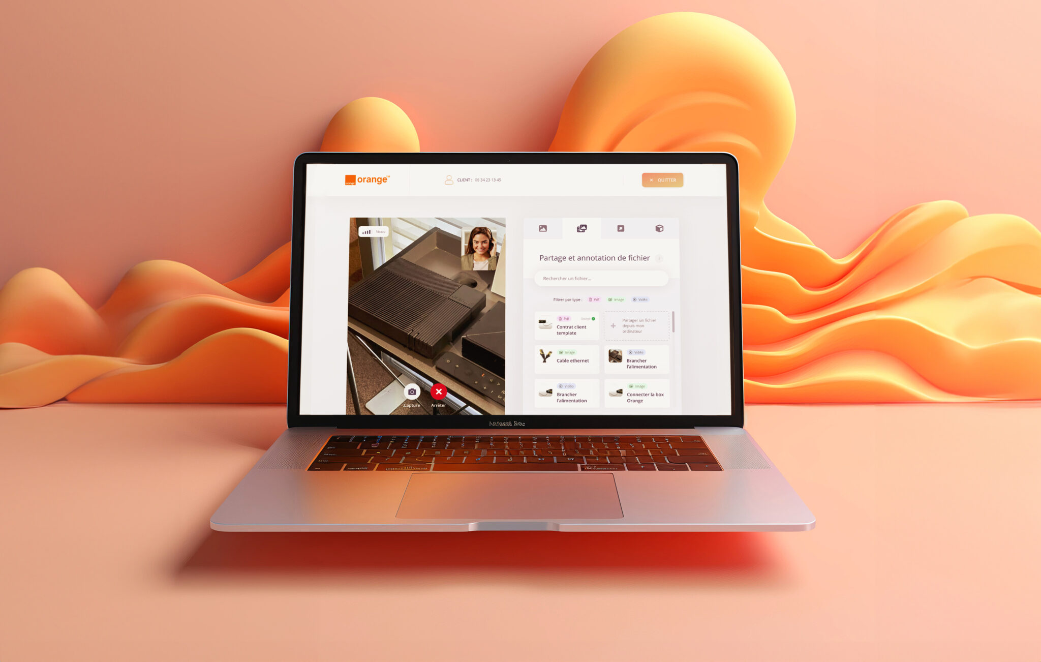
1 – A suite of tools for customer service advisors, including video calls, file/video sharing, digital signature, document annotation…
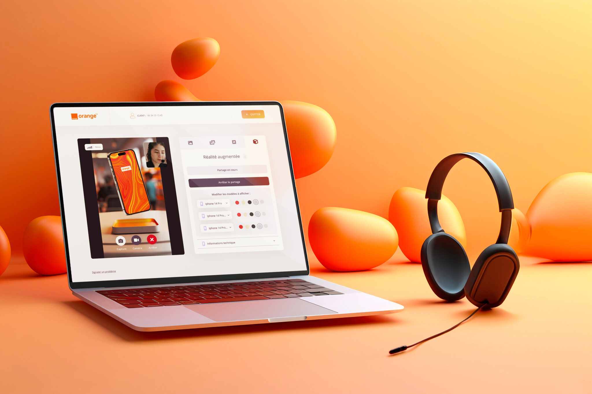
2 – An immersive 3D virtual store and augmented reality experience to assist sales advisors in achieving their commercial objectives.
The client access this 3D experience by clicking on a sms link sent by the advisor (Web3). He can manipulate 3D smartphones, and browse through several models, as he would do in an Orange shop.
Impact of the project
The impact of the designed solution is significant. Sales advisors who embrace the platform experience a remarkable 50% increase in sales compared to traditional oral phone interactions. On the Customer Service side, there is a notable improvement in problem resolution rates and speed for most issues. Both advisors and customers applaud the enhanced experience, citing improved understanding and increased engagement.
« It’s very different from a sales pitch where they call us to offer a new phone, but it’s completely abstract because we don’t see what it looks like… So, here, it’s closer to what happens when we’re in a store. »
Quote from Virginie 53 years old, during the user test about the 3D experience

